

Pastel Colors: What Are They and How to Use Them Right

Pastel hues, like those seen in spring flowers, hazy sunsets, and sweet treats, elicit calm and nostalgia. The beauty of these pastel shades comes from the way they may add a sense of sophistication and delicate feelings to any aesthetic arrangement.
From pastel color palettes to pastel color schemes, these delicate shades have captured the hearts of many, offering a unique visual experience. But what are pastel colors, and how can they be harnessed to create captivating aesthetics?

What Are Pastel Colors?
In contrast to their more vibrant siblings, a pastel palette has softer and less striking in appearance. They are made by mixing pure color with much white to get a more subdued hue. Soft pinks, baby blues, pastel yellows, mint greens, pastel purples, and many more are all included in the broad category of pastel hues.
Pastel palettes consist of a harmonious selection of delicate hues that blend seamlessly. It comes in pale colors with many variations and pastel shades based on the family of colors.
Exploring The Use of Pastel Colors

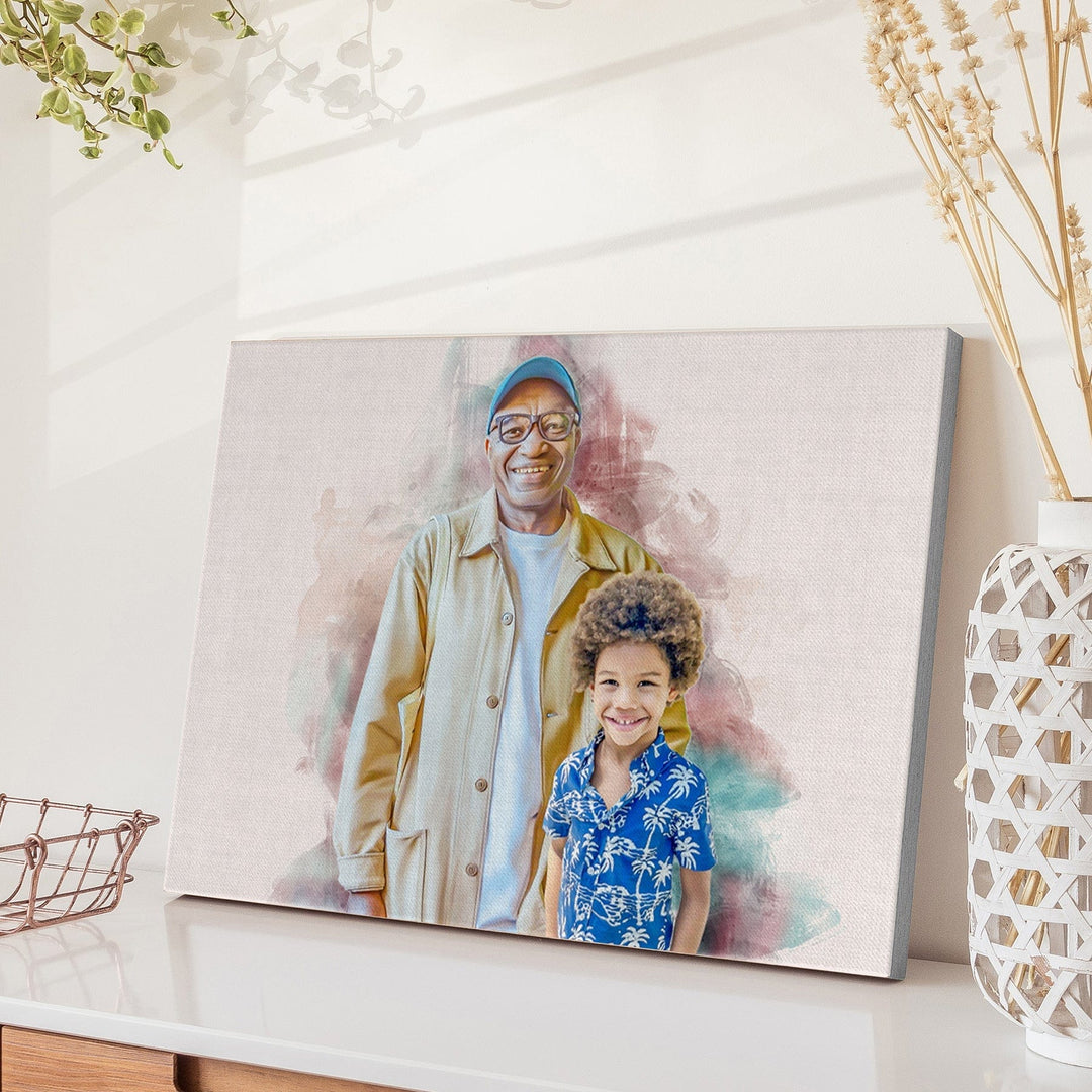
With the vast array of pastel color hex codes available, finding the perfect shades to complement any project is easy. Neutral shades like subtle pastel pinks, olive green, or creamy yellows offer a sophisticated and subdued design. These soft colors can be used in a combination of shades to evoke emotions in a couple pastel portrait.
Monochromatic color schemes revolve around a single original shade, utilizing various shades and tints of that hue. Complementary color schemes involve pairing hues that are on the different sides of the traditional color wheel. Triadic pastel color schemes incorporate three equally spaced colors on the color wheel, such as primary colors.
Top Pastel Color Palette
Whether playing with accent colors, planning on a design trend, or designing a bold brand statement, exploring the pastel family can inspire you to infuse your designs with a touch of subtle and timeless beauty. These are just some examples of pastel palettes. You may also try a pastel color palette generator to explore more pastel color combinations.
Beach-Inspired Color Palette
This palette draws inspiration from the soft tones found on sandy beaches. It includes pastel blue for the sky, baby pink reflects the seashells, pastel orange shows the sunset, and the pastel version of beige represents the sand.
Beautiful Fall Color Palette
Even though warm and earthy colors are often linked with fall, adding softer shades to your fall color scheme can make for a charming look. Lighter shades of vibrant yellow represent the autumn leaves, grayish greens represent nature, and mint blue comes from the color of the sky.
Bright Color Palette
This palette combines the brightness of bright yellow, fiery orange, steel blue, lively lavender, and lime green with a hint of pastel influence. It adds an energetic and playful touch to your designs while maintaining the delicate and calming nature of pastel shades, which can be good for pastel pet portraits.
Neutral Palette
Neutral pastel colors include earthy tones like beige for warmth, dusty pink for a romantic atmosphere, sage green for freshness and harmony, lavender gray for femininity, ivory for elegance, and a pale shade of yellow for an uplifting vibe.
Dark Color Palette
While pastel shades are typically associated with lighter shades, dark shades offer a more moody and sophisticated approach. Deep indigo adds depth. Burgundy brings sophistication. Forest green adds earth tones and charcoal gray gives elegance.
Applications of Pastel Colors in Art and Design
Pastel color combos have made their way into many areas of art and design, where their soft, delicate beauty has won over both artists and enthusiasts. Pastel colors can be used in many ways in art and design, whether on a painting, a runway, or a digital screen.
Incorporating Emotions into Paintings

Artists can portray a broad range of feelings in pastel portraits because of the sheer quality of pastel colors, which may vary from peacefulness and fun to melancholy and regret. Light pastel pinks and blues have been shown to elicit feelings of serenity and compassion, while soft pastel yellows and greens have been shown to evoke feelings of excitement and optimism.
Graphic Design
These soft colors can be used differently to make visually appealing and interesting images. They work well in simple, clean designs and designs with a lot of detail and complexity. Graphic designers can use a specific pastel color scheme to design a particular theme.
For example, pastel blues and greens can create graphics that feel calm and natural, while pastel pinks and purples give a sweet and whimsical feel.
Branding Design
Pastel colors are appealing and can be used in branding design, offering businesses a unique and memorable character.
Light pink is a delicate color that conveys a sense of tenderness, and sweetness, which can be suitable for baby products. A light purple shade can be used for brands associated with luxury and sophistication. Light blue is a gentle and calming color representing serenity and dependability.
Final Thoughts
Pastel colors are soft, muted colors that create a calm, peaceful atmosphere and give any setting a touch of beauty and grace. There are many ways to use these soft colors in your projects. By learning about the qualities and meanings of pastel colors and trying different ways to use them, you can make designs that look nice and give off a sense of calm and charm.
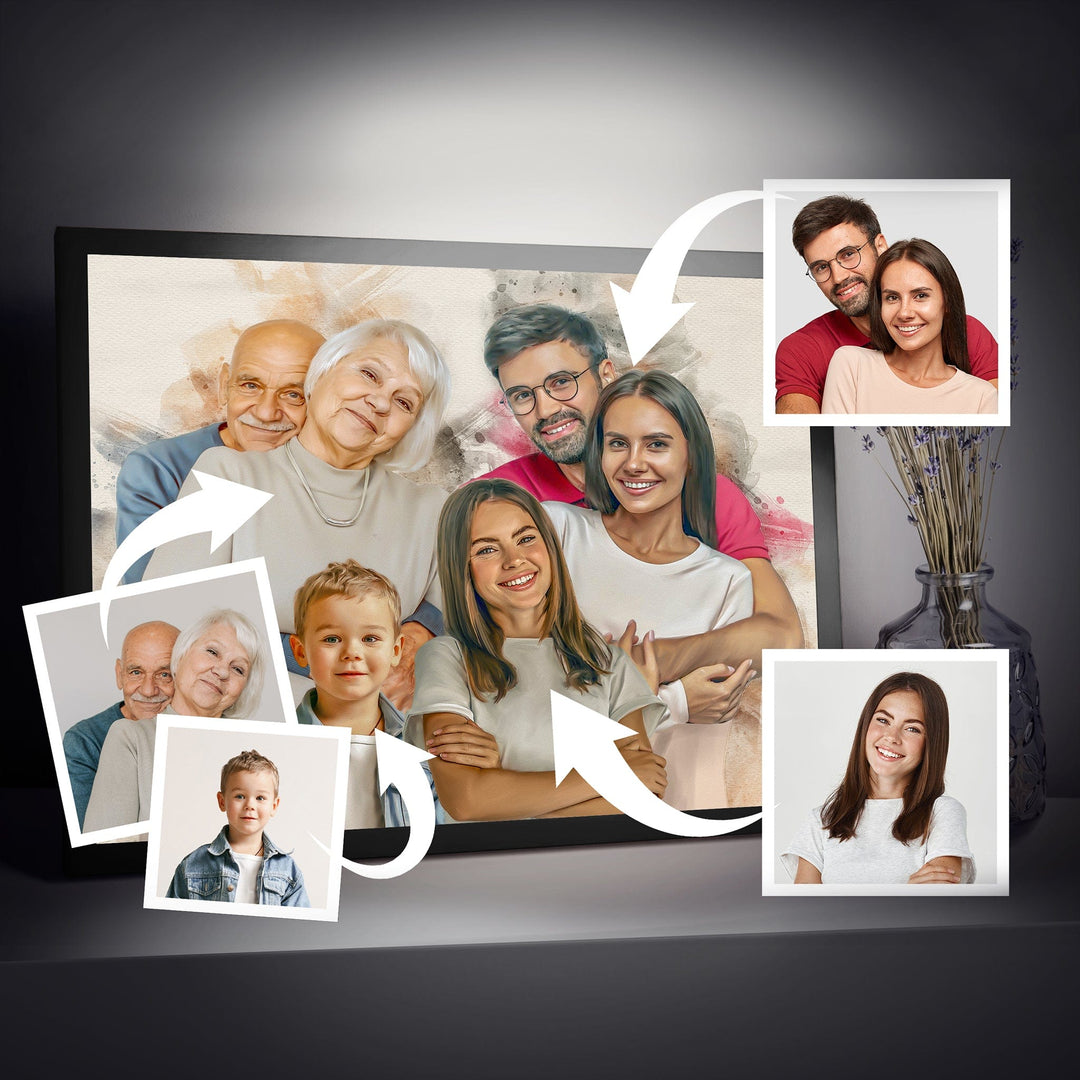
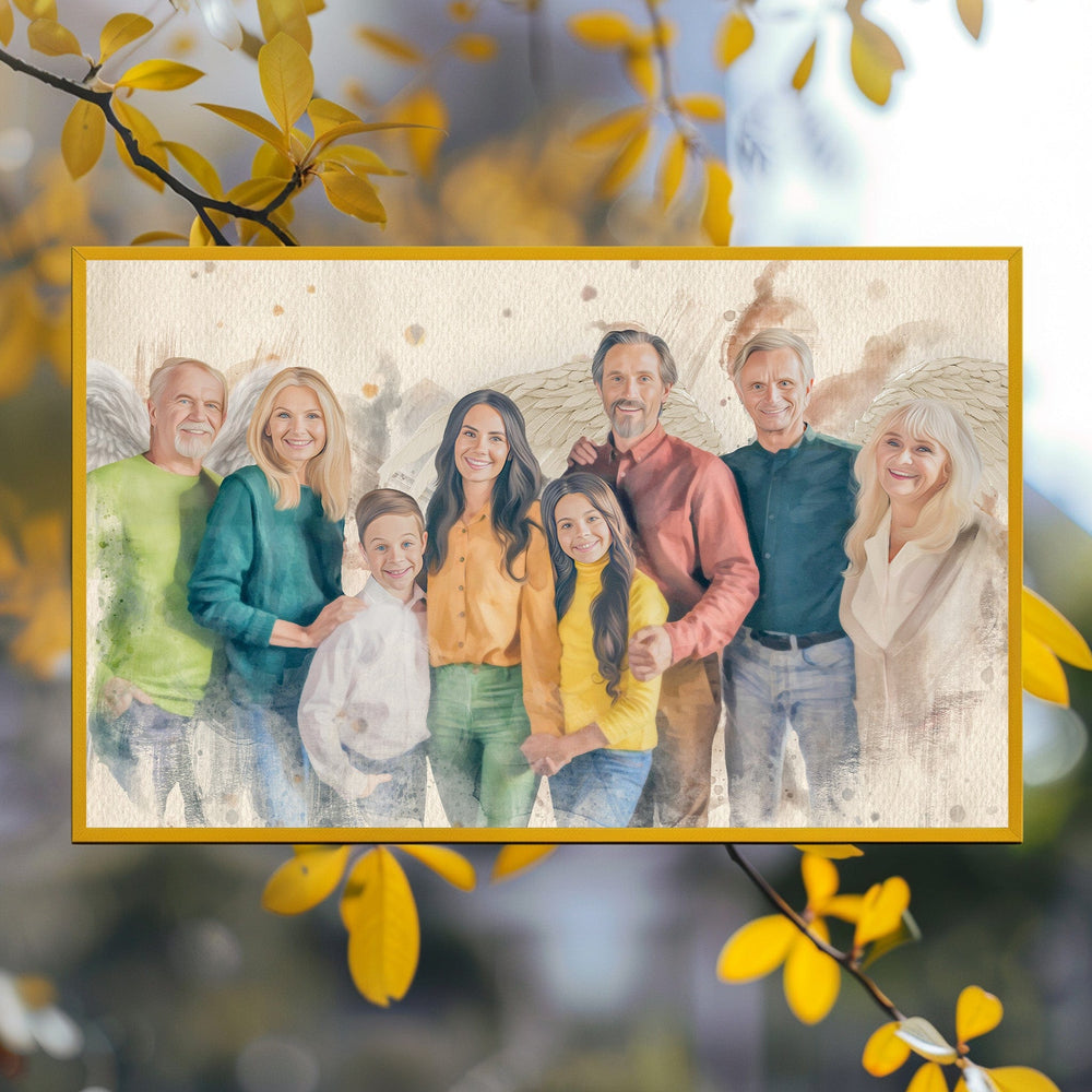
Personalize Your Memories Using Pastel Colors on Artworks From Memorialize Art
Memorialize Art can construct a visual canvas representing cherished moments and memories by incorporating various pastel shades that complement each other. Whether it's a family portrait or a wedding celebration, pastel colors can weave together a gentle and harmonious story that resonates deeply with the individuals commemorating these special occasions.